I once worked with an organization who had mastered vanity metrics as information radiators. They had a large development space with about 50 developers on the “floor”. When you walked in to the space for the first time it was very impressive. On nearly every wall was at least one if not several large flat screen tv’s showing fancy looking graphs and metrics with great animations.
After a day with the team, a colleague of mine who was joint consulting to the organization with me commented that the place was littered with vanity metrics as information radiators. It was the first time I had heard the term ‘vanity metric’ so I had to look it up to understand what he meant, but when I had, I realized he was absolutely right. Nobody on that floor actually cared about anything that was being displayed on the screens. It was there merely to impress - a vanity metric informaiton radiator at its worst!
What are Vanity Metrics?
Vanity metrics are metrics that look impressive but you don’t really care about them. They are often there to fill space. They could be registered users, downloads or raw pageviews, whatever. For me the actual thing being displayed is often not what determines whether it is a vanity metric. The real indicator is does anyone care about what is being shown? Is the number or graph or picture being put on the screen important to the people in the room? If it isn’t, there’s a good chance it is a vanity metric! What’s scary is that it is so easy to fall into the trap of using a vanity metric as an information radiator.
The Power of Information Radiators
I have found information radiators to be extremely useful in highly collaborative teams. Information radiators are intended to “radiate” information to the team. Ideally they act as visual triggers to a team that something needs to be done - be it, fix the build server, let an upstream dependency know that they are “down”, or remind the team when we last deployed. Information radiators used properly increase collaboration and conversation.
The Anti-Pattern
Vanity metrics that guise themselves as information radiators are extremely dangerous. They often give us a false sense that we are a collaborative team when we are not. Information radiators are too useful to waste on vanity metrics. Please don’t do it.
Strangely enough I’ve observed an uncanny correlation between how “pretty” a metric is displayed and whether it is a vanity metric or not. So far I have found useful information often looks butt ugly while vanity metrics often look really impressive and pretty.
How to avoid the anti-pattern
The best way to avoid the anti-pattern is to start with nothing. Scale the metrics down to a handful of things and then build it up over time. For instance, ask yourself, what is the one really important thing that can be “event or time triggered” that would be useful for the team to know about.
The general motto should be: “don’t let your message get lost in the noise. Focus on core!”
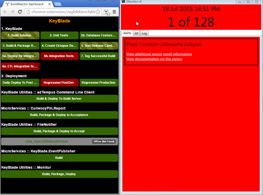
One such thing for me is failing tests on the build server. If the team owns the build server I want it to be in their face when it is broken. It should be something everyone should talk about. I find build progress a useful metric - I want it on my information radiator.
Once you have found a really useful metric, learn to represent the metric in as simple a way as possible to communicate critical event changes. This is often achieved by leveraging colors to act as visual queues to spark these conversations. For instance, in my culture the color red typically means something is wrong, while the color green means everything is fine. If a conversation needs to happen on a event in the system I usually make the indicator turn red. One side note about colors is to avoid too many colors. As soon as you have too many colors it is hard to remember what lime aqua represents.
Get it in their face
Finally, once you have found the handful of valuable metrics, you want it in your teams face all the time. If it is useful to put on one monitor, it is often useful to put on several.
If it is useful to put on one monitor, it is often useful to put on several.
Personally, I’ve found if you do standup in a certain place, it is really useful having the “health” of the system visually represented above the stand up board.
I’ve also found it extremely useful to have monitors placed in positons where the team sitting at their desks can all see the screens. Often this means having at least two screens up mirroring the same information because often people sit face to face which means if one person can see the monitor, the person opposite to them cannot because it would be behind their back. Be mindful of this, the extra cash you spend on screen pays for itself very quickly.
Leverage those information radiators
If you are lucky enough to have monitors in your development space mounted to walls, use them for good of the team and avoid the vanity metric information radiator anti-pattern.